For this project, we worked as a team of three to develop a unique campaign concept focused on the importance of saving water. The goal was to create something fresh and engaging, with a distinctive visual and conceptual identity that set it apart from typical awareness campaigns.

Starting Point
As part of a group project, we developed a campaign focused on the importance of saving water. After in-depth research, we decided to center the concept around our local environment–the Free State of Bavaria. We explored what defines Bavarian identity and quickly identified two iconic elements: the Wiesn (Oktoberfest) and German beer.
This led to the core message of our campaign: “Koa Wasser, Koa Bier, Koa Party”–a nod to the fact that beer is made up of 90% water.
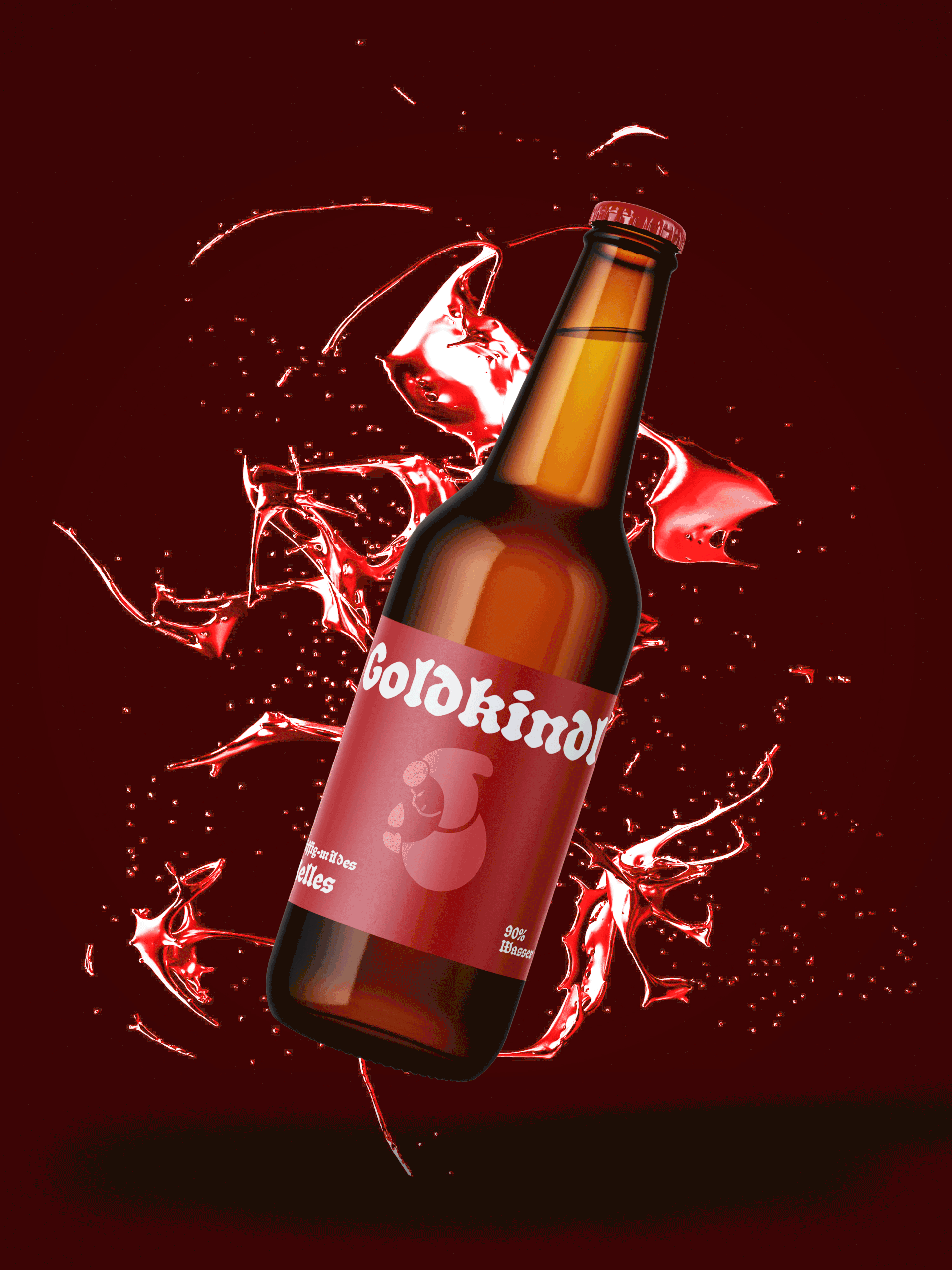
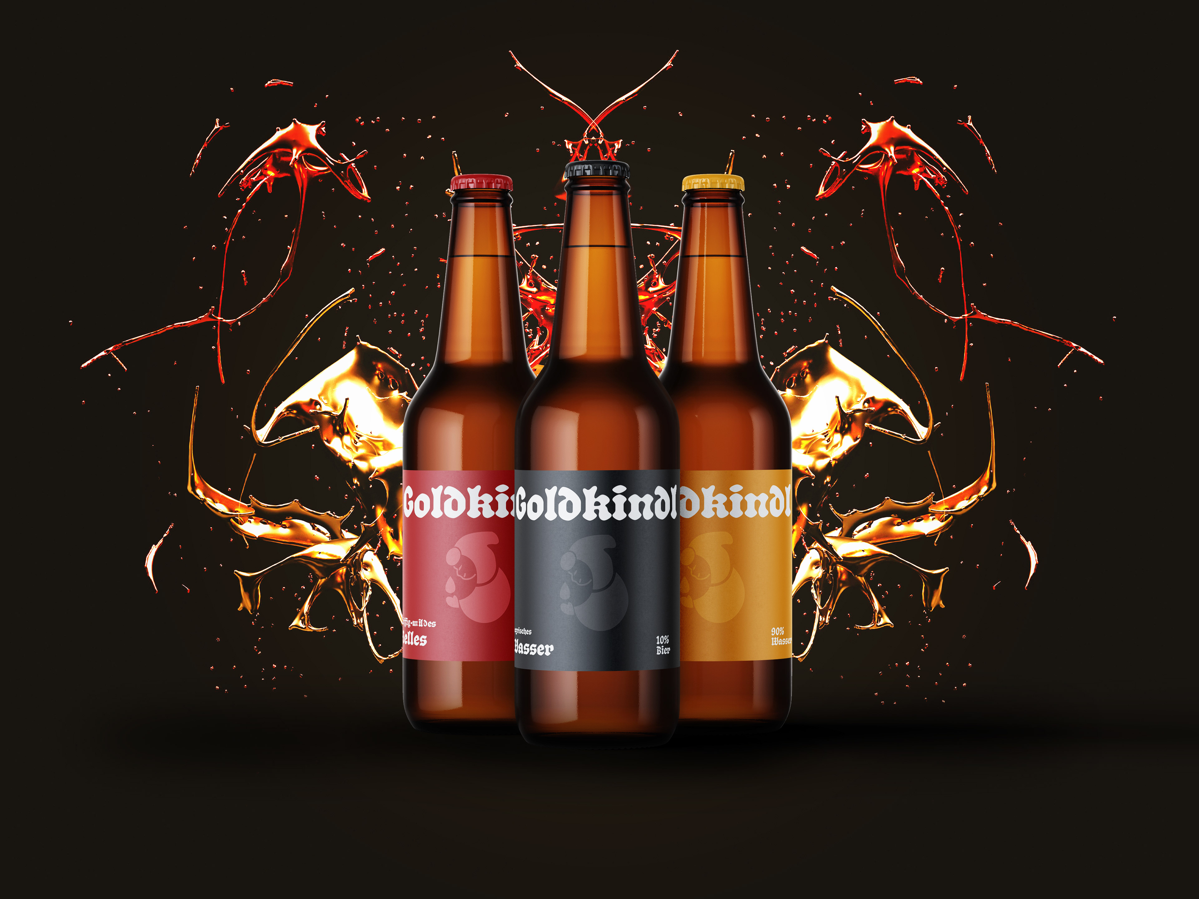
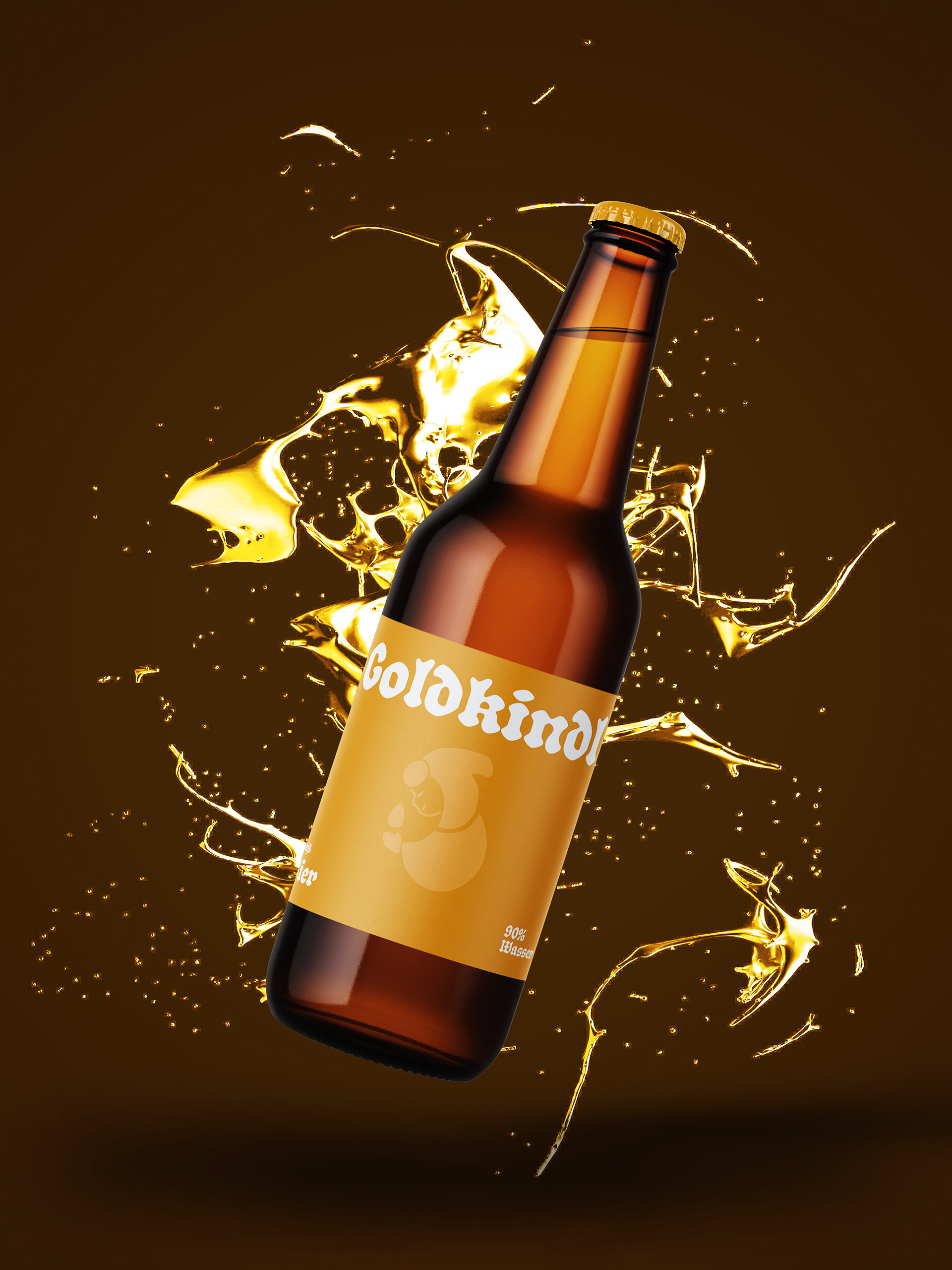
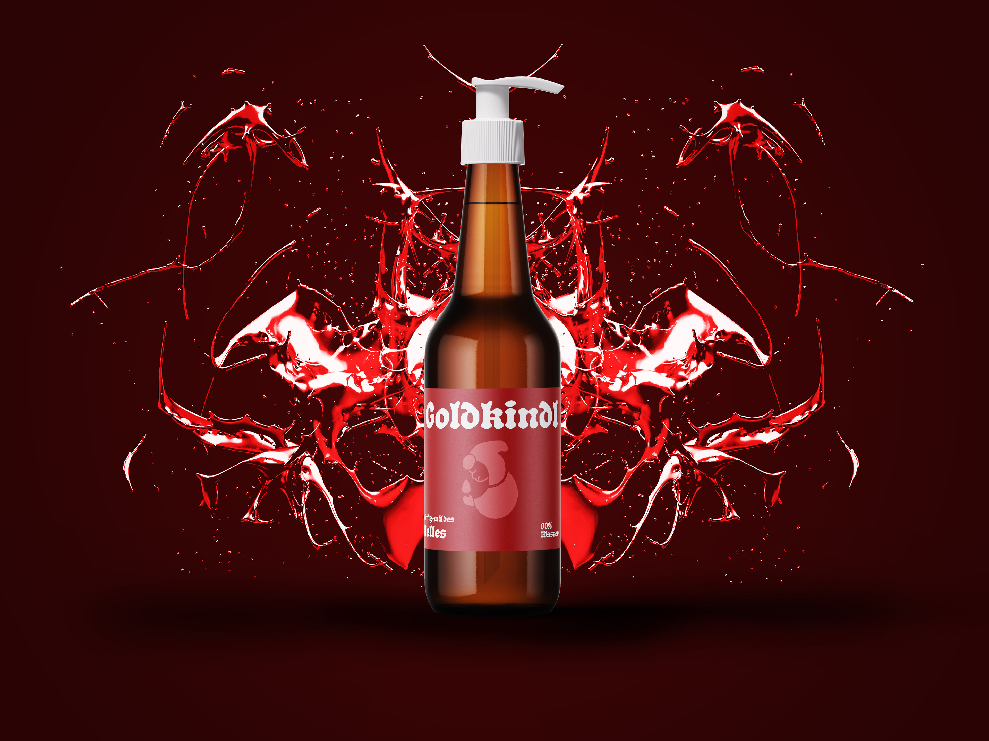
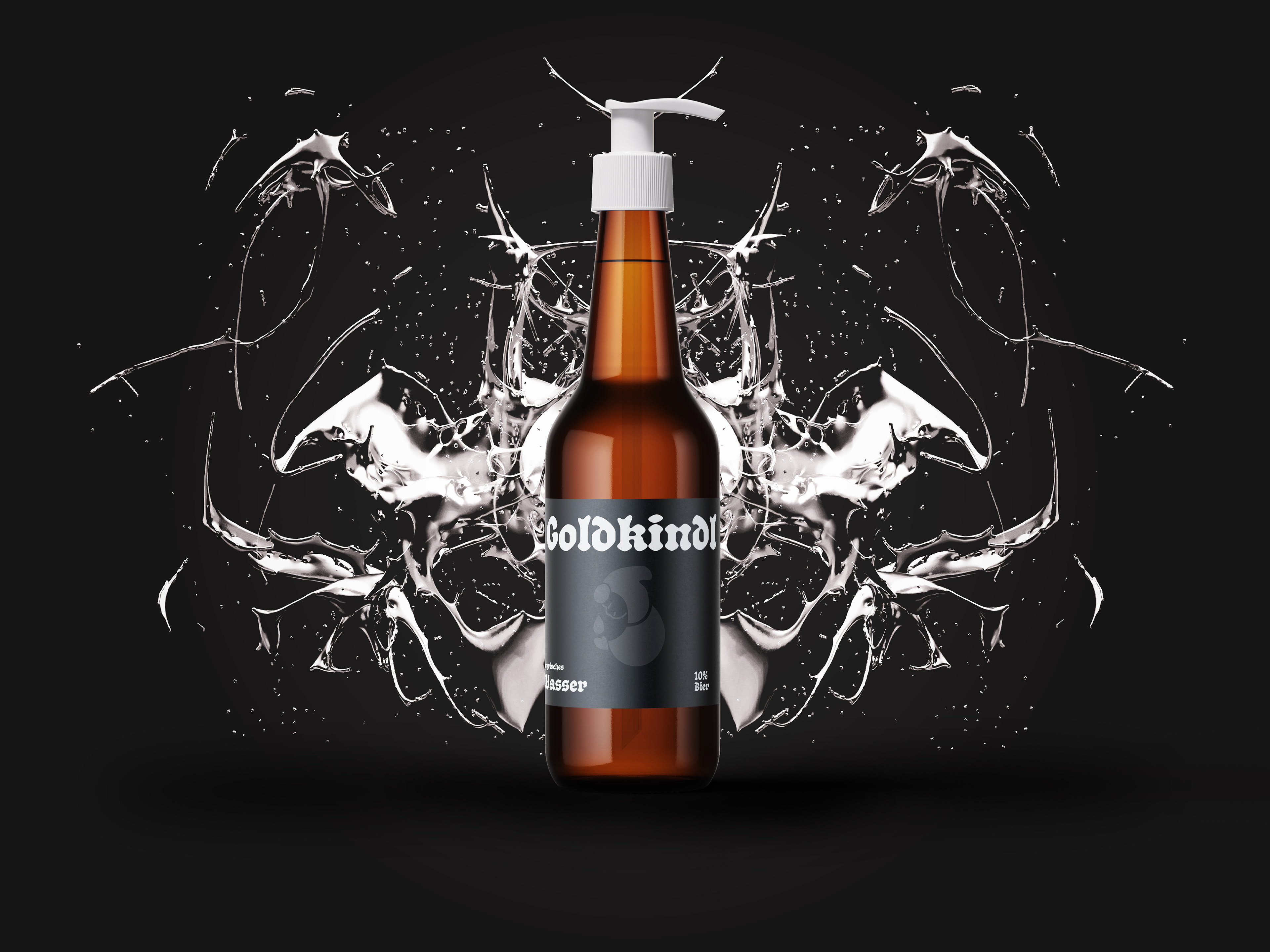
To bring the concept to life, we created a fictional beer brand called Goldkindl. Each bottle features an informative label about water conservation and is designed to be reused as a soap dispenser. This not only promotes recycling but also encourages repeated engagement with the message–turning a simple daily act like washing hands into a reminder of the importance of saving water.

GoldKindl Beer
To support the message “Koa Wasser, Koa Bier, Koa Party” (Bavarian for No Water, No Beer, No Party), we developed a concept for a beer brand called Goldkindl.
The name Goldkindl is inspired by the Münchner Kindl (“Munich Child”)–the young monk featured in Munich’s coat of arms. Drawing from the city’s traditional colors–black and yellow–we built a visual identity that connects heritage with a fresh take.
The branding uses a bold color palette of yellow, black, red, and white, all pulled from Munich’s coat of arms. The primary typeface is Schmaltzy by Matthijs Herzberg, chosen for its perfect blend of traditional character and modern flair.
We also designed a custom brand mark: a water droplet containing a side-profile illustration of the monk, holding another droplet. As a subtle detail, the monk’s hood mimics the top serif of Schmaltzy, tying typography and iconography together.